composition
|
Composition is the placement of objects in the frame of a photo. Composition often relates to the rule of thirds and the subject of a photo is commonly placed along the lines or cross section of the grid of thirds.
Rule of thirdsThe rule of thirds is a composition technique that photographers use when deciding on the placement of objects in the picture. The rule of thirds can be a grid on the screen, three by three (consisting of 9 boxes), which can help line up the photo and place objects on the cross sections.
|

|
balance
|
Balance in photography is observed when an image has subject areas that look balanced throughout the composition. It is achieved by shifting the frame and juxtaposing subjects within it so objects, tones, and colors are of equal visual weight.
|

|
triangles
|
Triangles are a great way of grouping together three points of a photograph and organising them to portray a certain feeling such as stability, aggression, instability, etc. When you understand this, you can use them as invisible features of a photo to evoke strong feelings in the viewer.
layersThis technique involves using foreground, subject and background so that all layers of the images work together to help tell a comprehensive story.

|

|
framing the enviroment
magnani

|
|
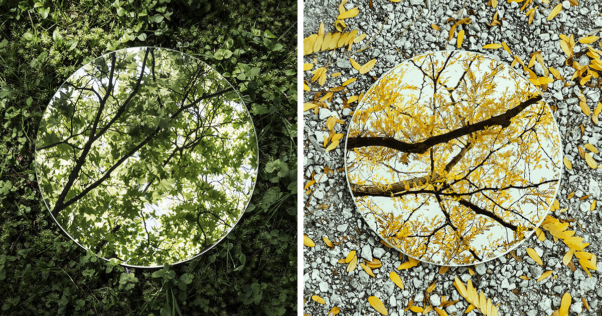
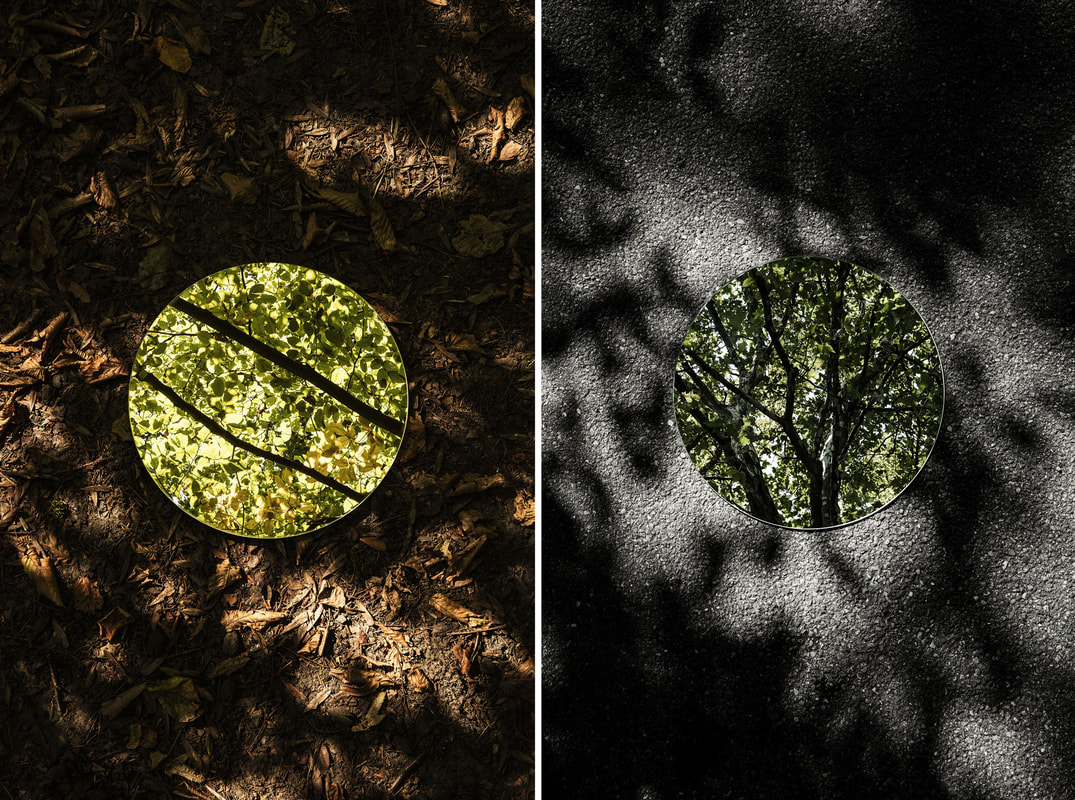
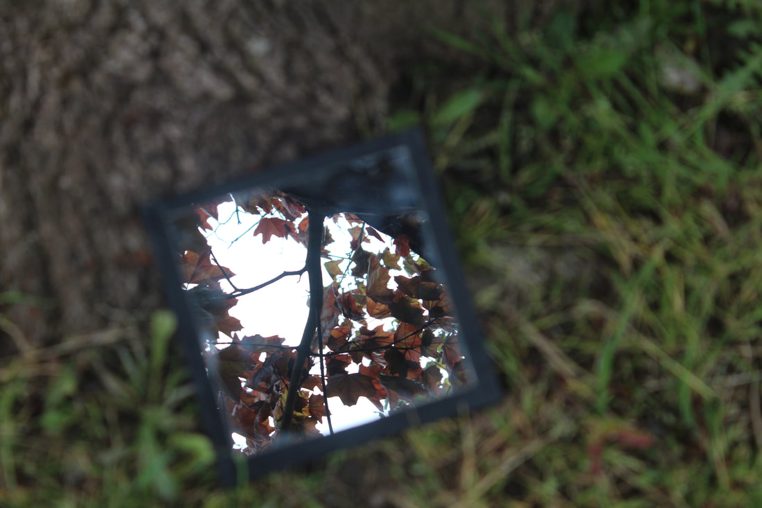
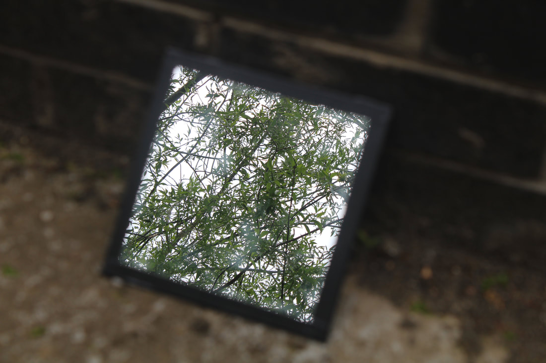
Sebastian Magnani creates contrast in his photo of the environment. He does this by placing a mirror on the ground and therefore creates a juxtaposition of the earth and sky in one photo. I like his work because there is often a contrast of colours ranging from earthy greens and browns to vibrant yellows and bright pinks.
task
|
|
I chose these photos because I felt as if they represented Magnani's photos best. In these photos there is a clear contrast between the ground and the sky or the ground and a contrasting colour.
If I were to do this again, I would find other natural colours from different plants and flowers instead of getting the colour brown from dirt and green from leaves. During this photoshoot I found it difficult to set the camera to the right aperture. Often, the picture in the mirror would be in focus but the background wouldn't. |


|
|
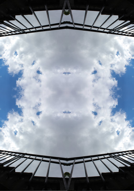
andy yeung

|

|
|
|
Andy Yeung takes pictures from the ground, looking up at the sky which shows the architecture and structure of buildings and city landscapes.
|
|

|

|
My photos worked well because they were edited on photoshop and show an understanding of Andy Yueng's work.
My photos could be improved if I went to different location to show variety. |
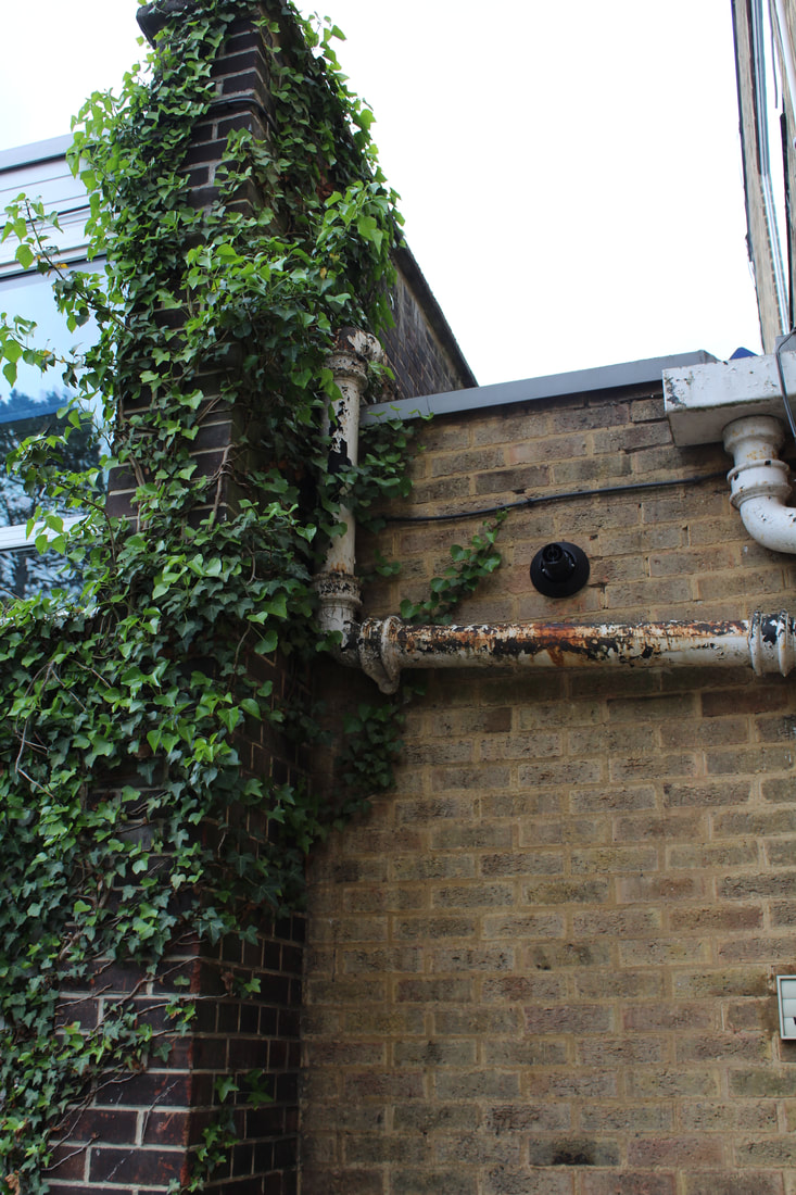
Wild Concrete - romain Jacquet-lagreze

|

|
|
|
I like Romain Jacquet-Lagreze's work because it shows a contrast between nature and concrete which also shows contrast between colours. She shows how trees and wildlife is strong and can grow in unnatural places such as out of and around buildings in a rundown city. The contrast between concrete and plants is interesting because it enforces the vast power of nature and its capabilities to take over something man-made/produced in warehouses. |

|
|

I managed to create a rustic and overgrown theme with my images just as Romain Jacquet-lagreze did with hers. I focused on composition and tried my best to work with areas around the school.
If I were to do this again differently, I would focus more on a range of different buildings and try and find places with rundown and slightly less developed looks.
If I were to do this again differently, I would focus more on a range of different buildings and try and find places with rundown and slightly less developed looks.
Close Up and Far Away
|
Colin Winterbottom zooms in on details such as scratches, dents, rusting and other considered 'flaws'. This is interesting because it shows that these problems with the surfaces can become an interesting pattern in an unexpected way. |
|


'Close Up Far Away', shows small parts of a surface and then reveal the object as a whole from far away. This project links to the theme of perspectives and view points. The close up photo shows the individuality of the details within the surface while the bigger picture shows what the details belong to and can be put in context.
WWW: Light intensity and levels with natural light made it easy to focus and get a clear image. This is because this photoshoot was by a window. I had the benefit of natural daylight.
EBI: If I were to do this again differently, I would go closer up on the close photo and I would try not to include any types of shape that gives away what the object is. This creates a sense of the unknown and creates a wider variety of possibility.
close up far away holiday development
|
In this development of the 'close up, far away' photoshoot, I chose to photograph the wildlife I could find in my garden and on my road. In my first photoshoot, I took pictures of school supplies and classroom elements. I find this interesting because the two photoshoots are extremely different given that one is industrial and the other is naturalistic.
|

|

|

|
independant developement
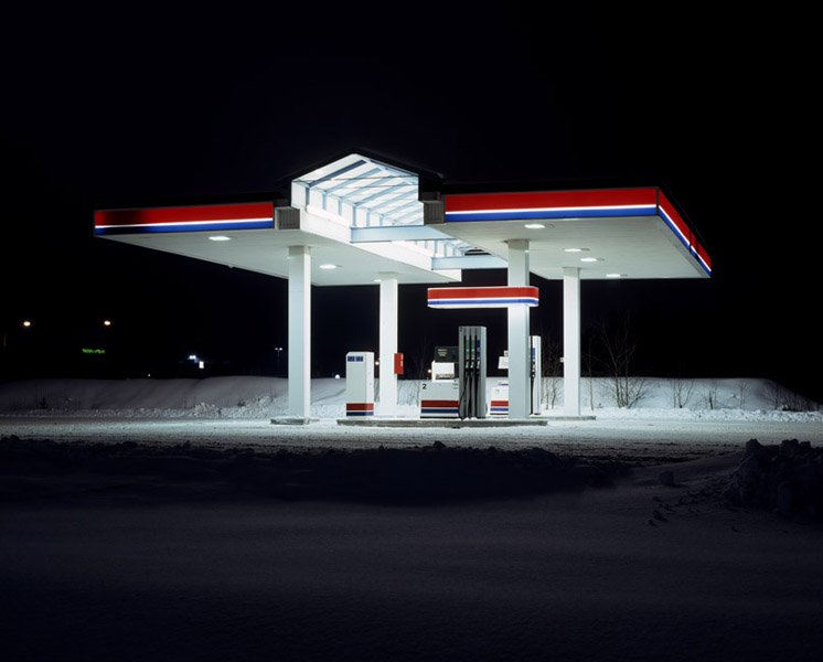
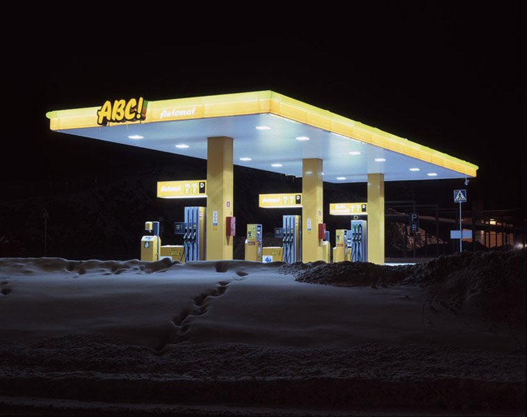
Matt Barnes
|
|
I chose Matt Barnes because I like the dark contrast of the night with the sharp bright lights at the petrol station. Matt Barnes creates a sense of emptiness by showing a normally popular place with no one in it. Another contrast is the block colour of the rims of the building in contrast to the black sky.
However, this project didn't work as well as I hoped. When trying to take pictures, the absence of people in Matt Barnes's photos was what was lacking in mine. I found it difficult to set the right shutter speeds for this type of lighting and therefore my pictures different turn out with the same type of affect.
However, this project didn't work as well as I hoped. When trying to take pictures, the absence of people in Matt Barnes's photos was what was lacking in mine. I found it difficult to set the right shutter speeds for this type of lighting and therefore my pictures different turn out with the same type of affect.
James Casebere

|

|
I chose James Casebere because he creates a sense of emptiness by illuminating cardboard room with light. The bare walls and harsh white light create contrast. Casabere also uses composition very clearly with the windows tending to be on the right side of the image.
The shadows and combination of colours on the greyscale show how light intensity creates different approaches and themes in a photo.
The shadows and combination of colours on the greyscale show how light intensity creates different approaches and themes in a photo.
next DEVELOPMENT
extended - car park
|
|

|

|


|

|

|

developement
|
|
|


|

|

Here, I explored places that relate to me and hold significance in my life while also reflecting Matt Barnes's empty spaces. The aim of this project was to photograph places that would normally have lots of people but now do not. For my location, i chose to photograph Alexandra Palace Ice Rink. I chose this place because I play lots of ice hockey here and it is normally full of people. In these photographs I am trying to portray the presence of absence.
Hiroshi Sugimoto

|

|
I chose Hiroshi Sugimoto because I like the sharpness of the screen compared to the dark interior. Sugimoto captures images head on to the screens in order to line up the corners of the room to there vanishing point in the middle of the screen which creates an inward pulling perspective.


|
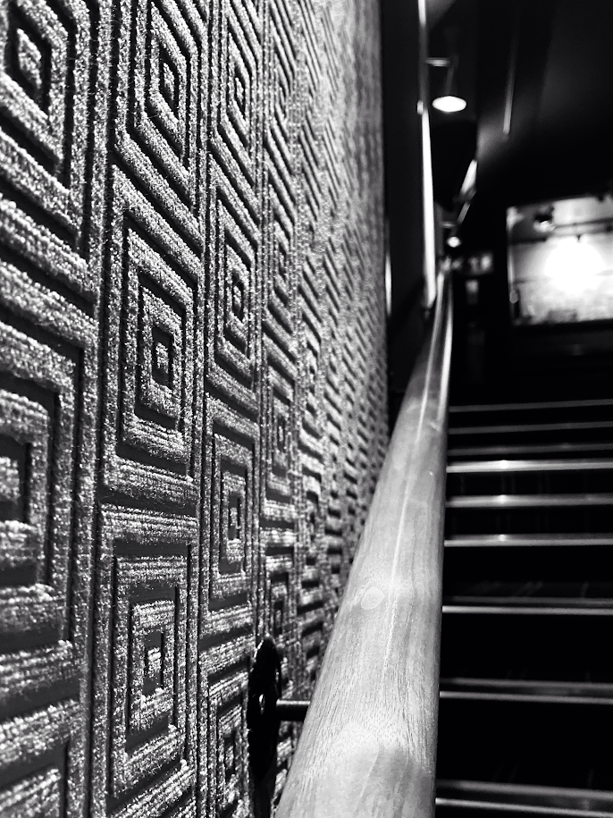
WWW: I turned down saturation levels completely, meaning my images were black and white just like Hiroshi Sugimoto. I also increased the brightness and contrast to create a sharper contrast between the dark and light colours.
: My images didn't relate to Hiroshi Sugimoto's cinema screens however I took the photos in the cinema to create a different view point based around Sugimoto's. |
My response to Hiroshi Sugimoto worked well because it showed the presence of absence in a place that would normally be full of people that is now empty. This shows the effect corona virus in the current situation is having on the public.
In this development task I will be taking photos of the empty stands at my ice hockey club and the parking lot, to reflect the same theme of the presence of absence. The seats will be empty due to cover restrictions and it this will create the feeling of being alone, just like in Hiroshi Sugimoto's photos.
In this development task I will be taking photos of the empty stands at my ice hockey club and the parking lot, to reflect the same theme of the presence of absence. The seats will be empty due to cover restrictions and it this will create the feeling of being alone, just like in Hiroshi Sugimoto's photos.
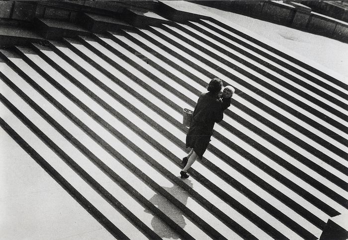
Alexander Rodchenko
|

|
I chose Alexander Rodchenko because I liked the harsh contrast between the black and white of the street and industrial roads and olden era he shows in his images. Rodchenko focuses on strong shadows and specific natural lighting. His photos show a lot of structure and show a set purpose where objects, people or road signs are set firmly in certain places. This shows he is focusing on composition.

|

My photos had similar and different aspects in relation to Alexander Rodchenko's photos. Qualities such as contrasting stripes and patterns showed the similarities between the photos, while other qualities such as the location of the photos showed the differences.
|
