JR CHRONICLES – SAATCHI GALLERY
JR: PORTRAIT OF A GENERATION 2004 - 2006
|
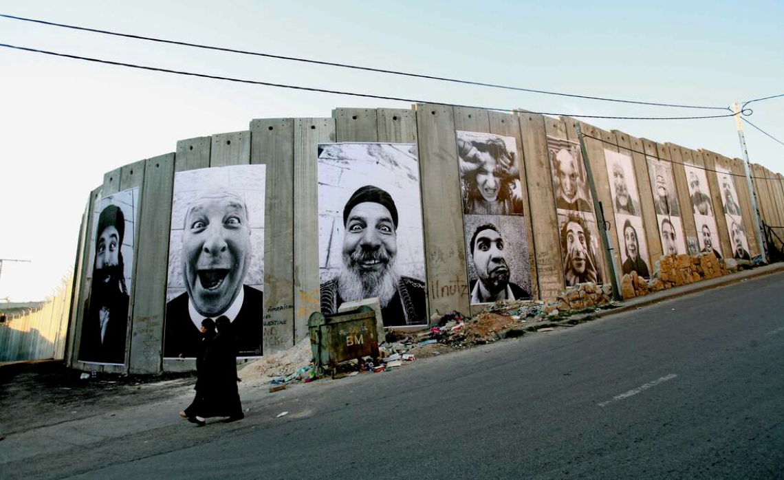
JR took these photos during the time of the 2005 French riots (a three-week period of riots in the suburbs of Paris and other French cities). The riots resulted in more than 8,000 vehicles being burned by the rioters and more than 2,760 individuals arrested..
These photos are about the media's interpretation and presentation of looters. The media will show photos people looking angry or frightening to make the viewer have a negative reaction to looting and create a stereotype to looters. JR's portraits help convey the other side of the looters' anger and shows their smiling, happy and friendly side. This can create a sense of community, togetherness and the human nature. (That there is more to the monster that the media tries to reflect onto the public.) All of JR's portrait photos share the same range of facial expressions that show the smiling face and the angry face. It shows how so many people can look terrifying when portrayed by the media but have a completely different side which never gets shown. In this case the media try and make the looters look like the enemy but really they are enforcing a hatred and fear of these people who are proving a political point. 
|
|


|
|
|

|
|
|
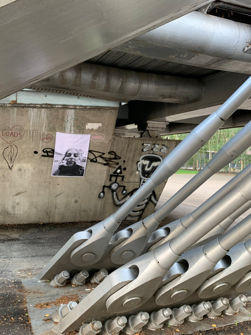
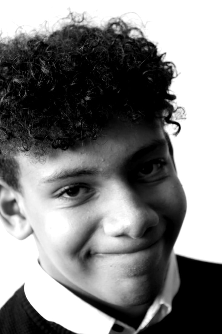
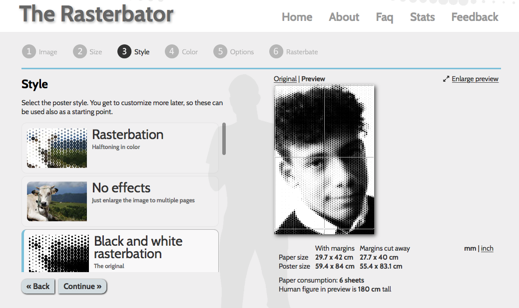
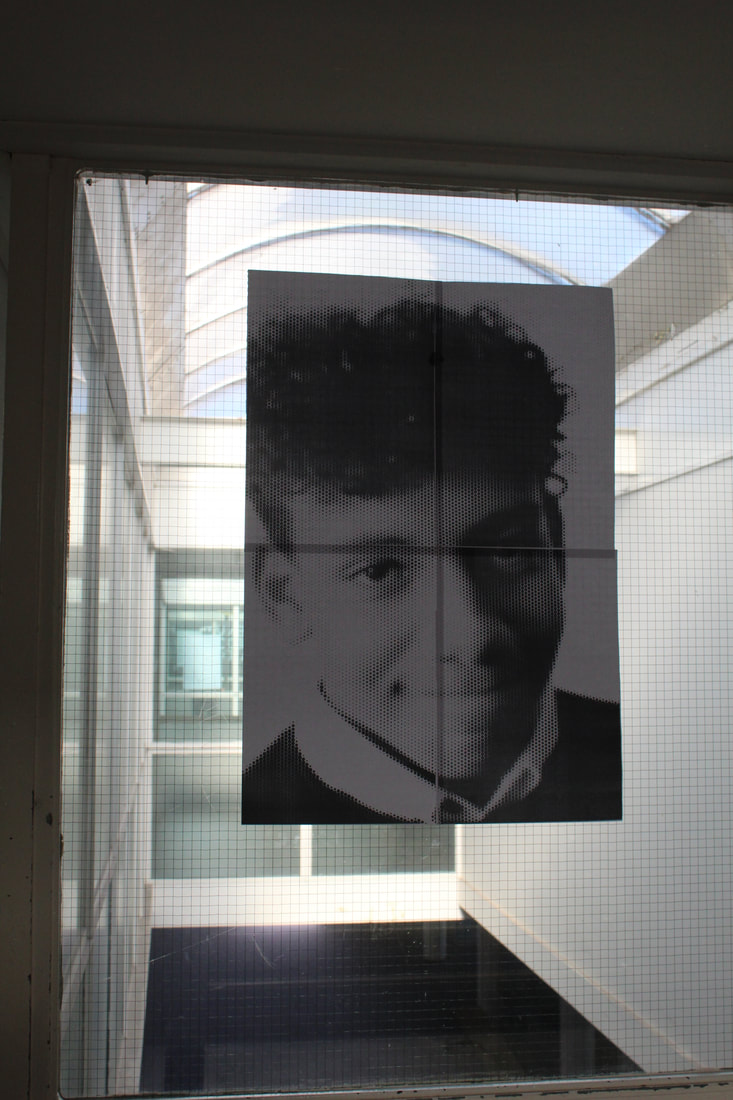
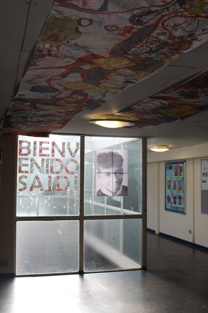
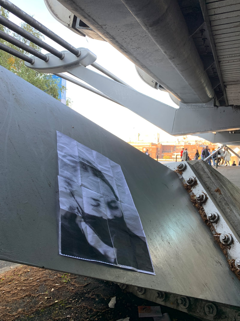
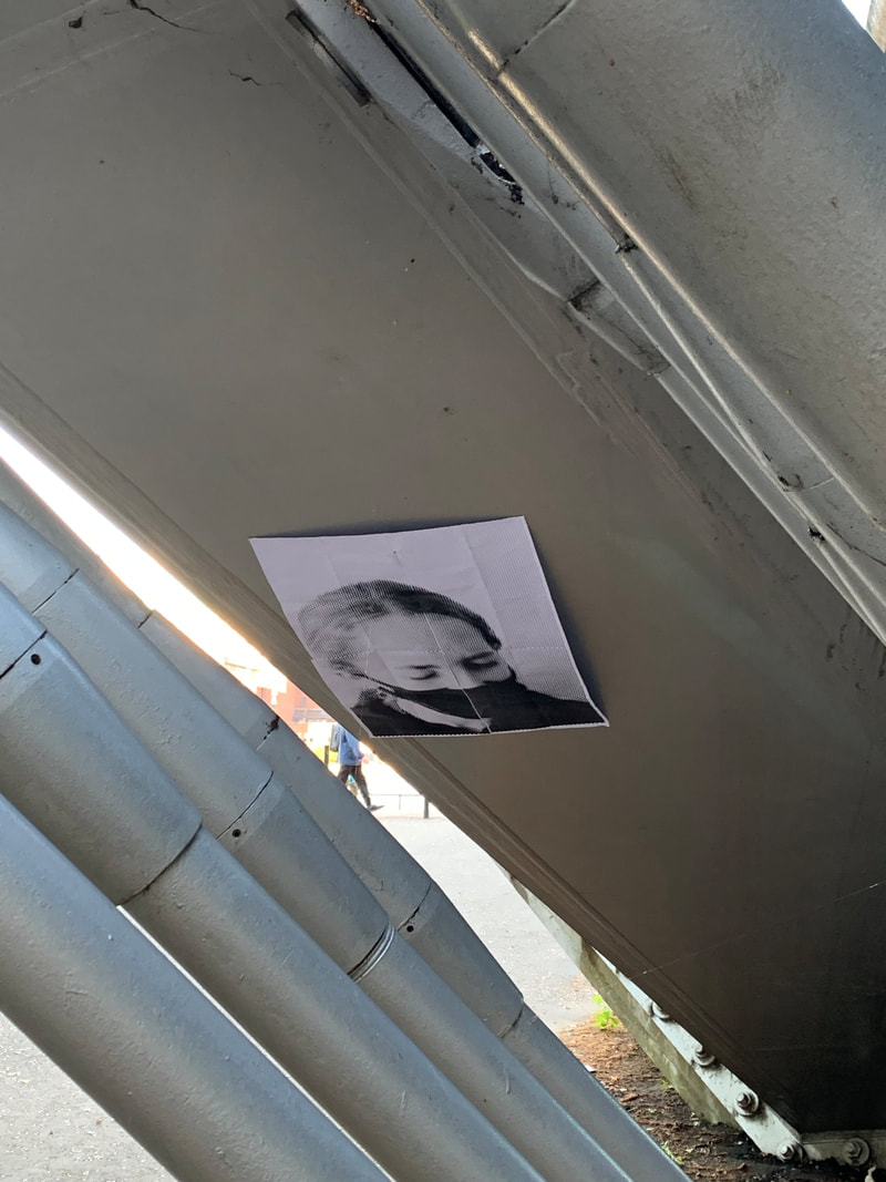
My response to JR's work had positive and negative aspects. One negative element was the poster size in proportion to the rest of the image. I felt like the poster was too small to have a real impact on the photo. In JR's work, he makes the main focus on the person and uses a dull background to make the poster stand out.
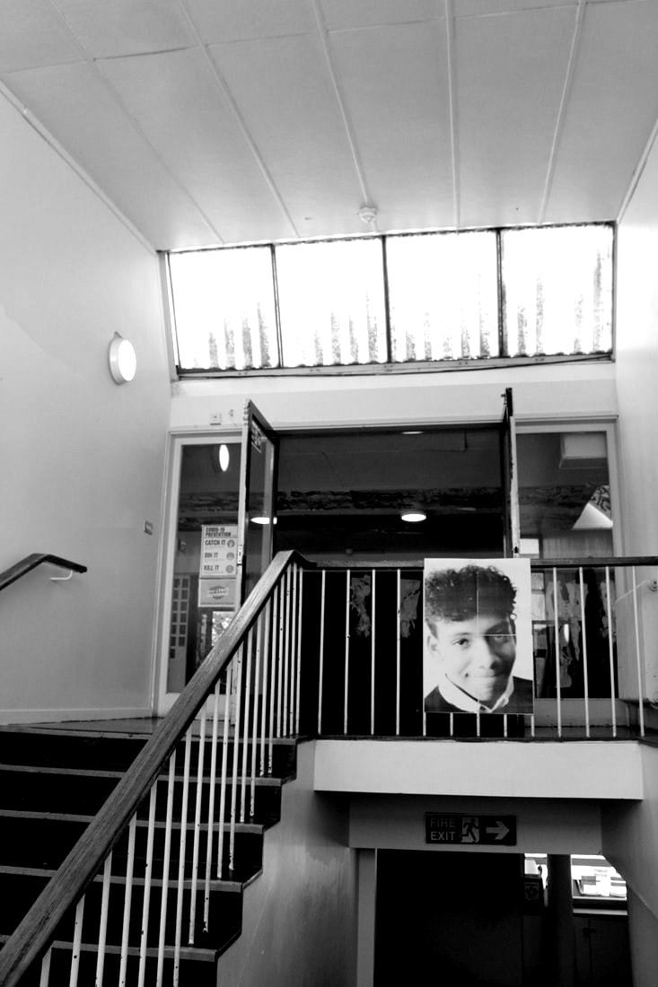
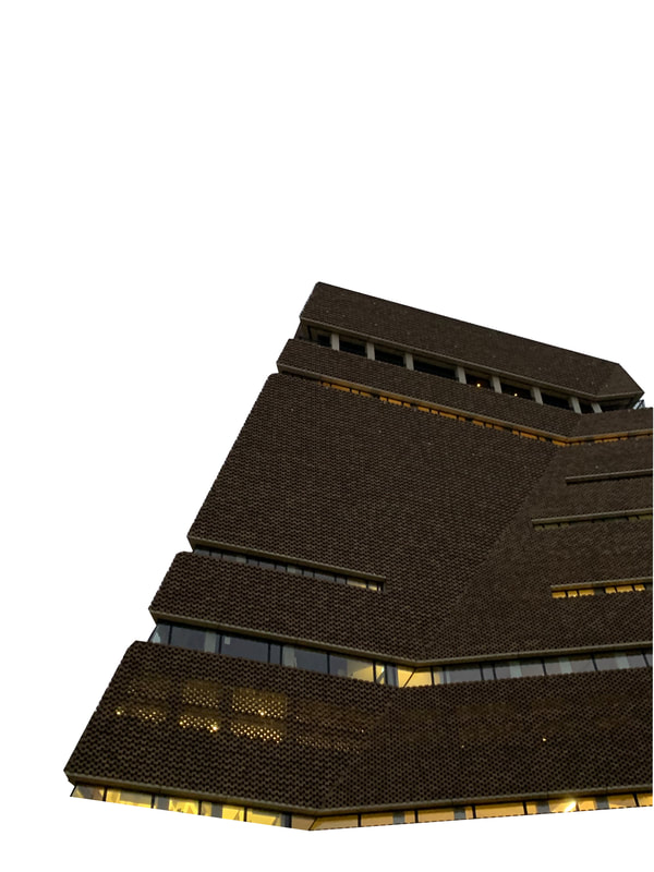
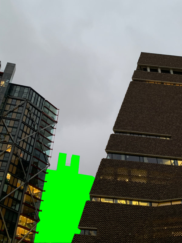
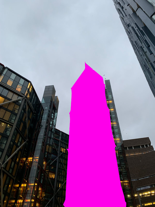
One positive aspect of my response was the location. For this photoshoot I went to South Bank, The Tate Modern, London Bridge and St. Paul's Cathedral. |
|
gordon magnin
|
|
|

|
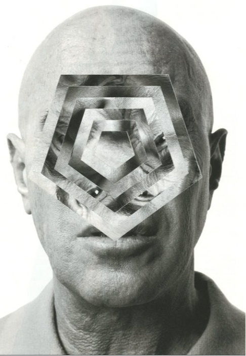
Gordan Magnin's work is surreal, futuristic and alienated. The distortion of the face is rather like Alma Haser's work. Magnin creates images that may take longer to process than an ordinary photo. The way he creates patterns on photoshop get you to explore how he has changed the model's face and shows you how complex people's features are. However it shows us that even when a face has been distorted like this, our brains can still tell how human the face is.
|
kehinde wiley


|
|
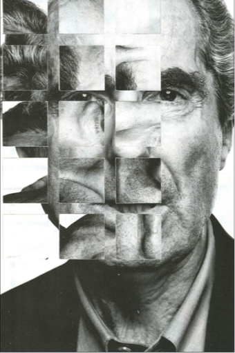
To imitate Kehinde Whiley's work, I chose from a variety of patterns to edit over portraits used from previous photo shoots. We edited these photos in photoshop where we created two layers (the portrait and the texture/fabric). We then turned the opacity down so that we could erase part of the portrait to reveal the pattern underneath, making is look like part of the pattern was on top or wrapping around.
|


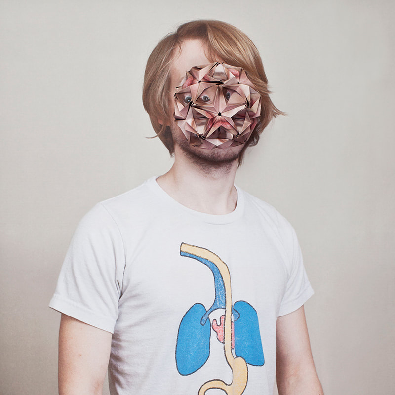
alma haser - cosmic surgery
|
|
|
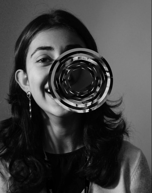
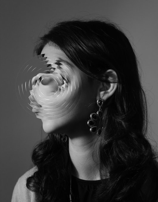
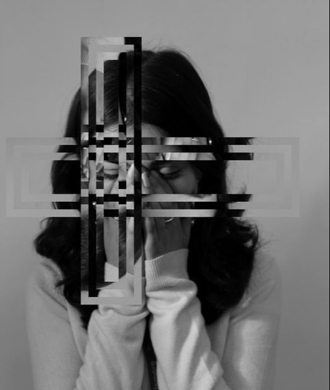
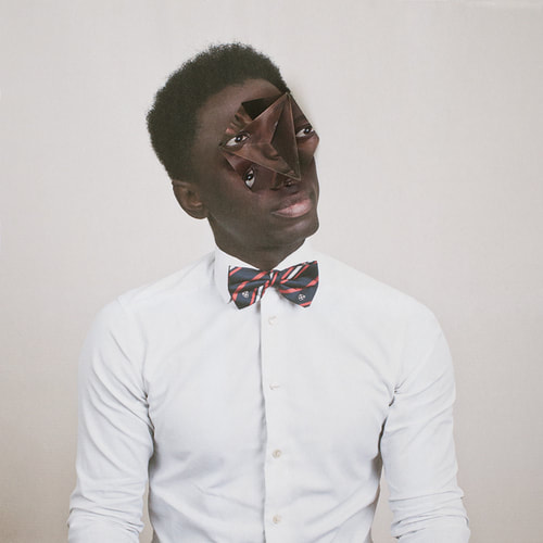
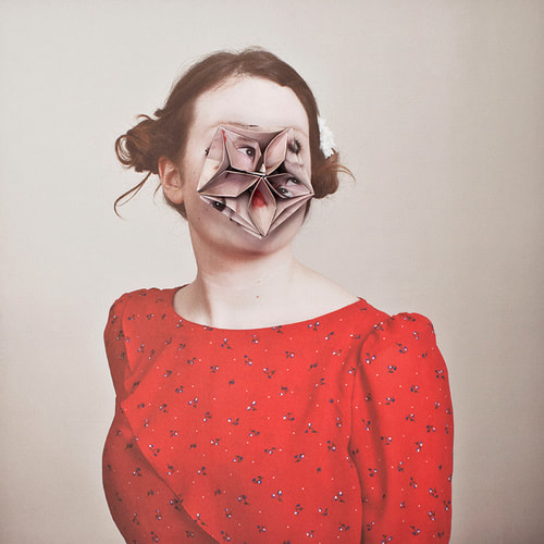
Alma Haser creates surreal images. She does this by creating complex origami shapes from another picture of that same person. Then she places it on top of the image which creates a distortion of the persons face. Although it becomes distorted you can still understand that it is their face because of the fact that you can still see eyes and part of a mouth. This is because you can still see some features even after the origami.
Alma Haser creates these photos to make us aware of future generations and creates a sense of feeling detached from something u think you know well by changing the appearance of someone purely through origami. Haser says that it is easy to get lost when doing origami which seems to be meditative and relaxing. Because this allows her to think or contemplate, the images then are given a 'backbone' or purpose. Haser has used origami when creating this work. This creates an alienated and futuristic effect. This helps support Haser's point about getting lost while creating her work. |
|
|
|
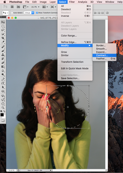
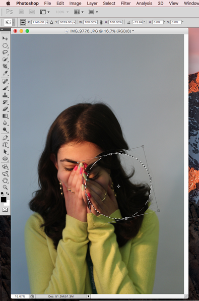
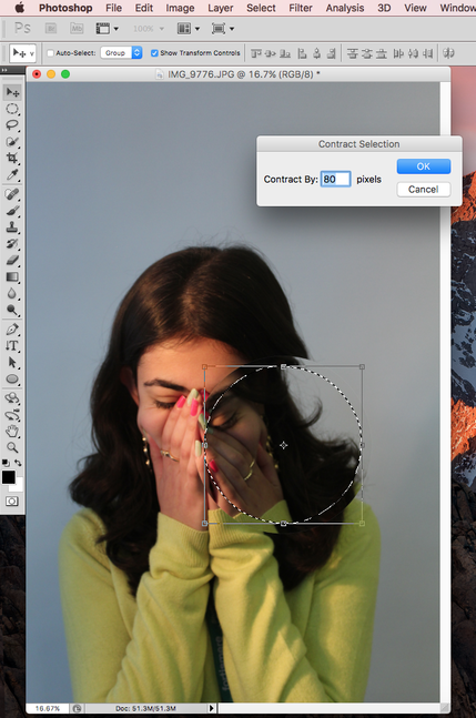
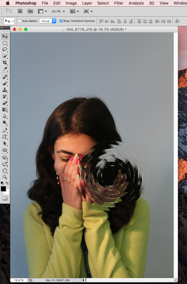
In order to respond to Alma Haser's work, I had to be able to fold the portraits in a way that would create fragments or distortion. I used a polygon net to create the blown up shape and the chatterbox to create the imploding affect. Both folds worked well as they were able to keep the resemblance of the face while distorting it at the same time. However on the chatterbox, the paper ripped in the middle. If I were to do this again, I would take more care in the folding process.
|


|


|
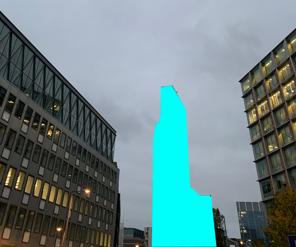
fragments of buildings
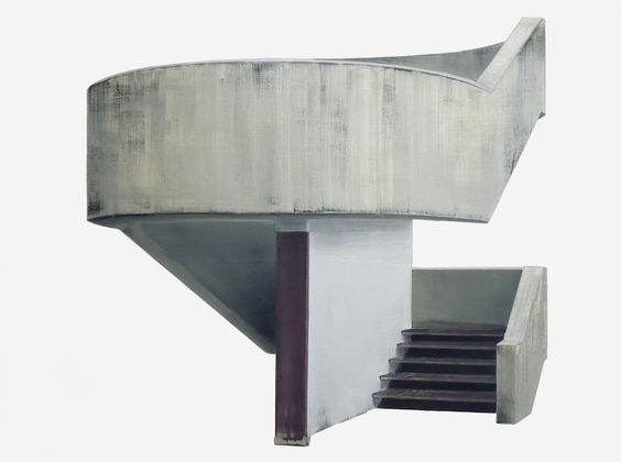
Patrick cornillet
|

Patrick Cornillet selects fragments of concrete buildings and isolates them in front of a white background. This shows the simplicity of the material and the the type of architecture produced at a certain time. This type of photo gives the viewer an alienated impression of the building.
|
|
What went well about this response to Patrick Cornillet's work was that the white background surrounds the buildings and creates a similar atmosphere that the concrete structures do. However, the buildings material is more complex and therefore they don't reflect the use of the one material used, concrete.
|

|
mauren brodbeck

|

Mauren Brodbeck takes photos of forgettable buildings and highlights them with neon colours. This expresses that because the building is forgettable and almost irrelevant to the passer-by, the neon fill shows how once the building can't be seen it isn't remembered. The colours added almost give the buildings a new purpose and this could highlight their presence.
|

|
|
|
|
thomas kellner
|
|
|
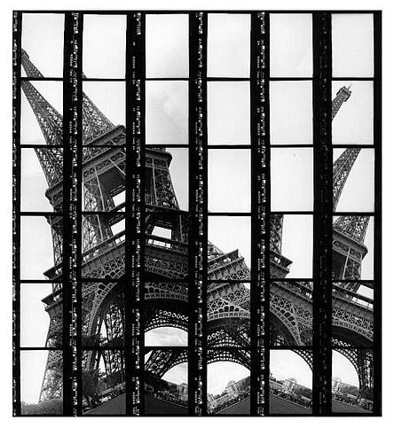
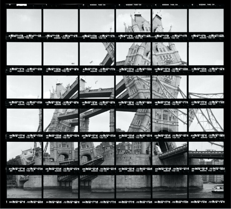
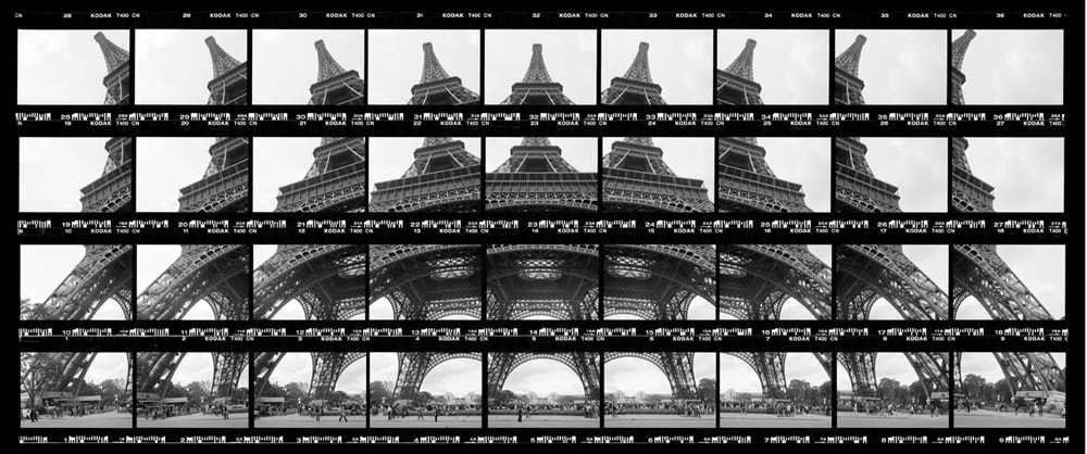
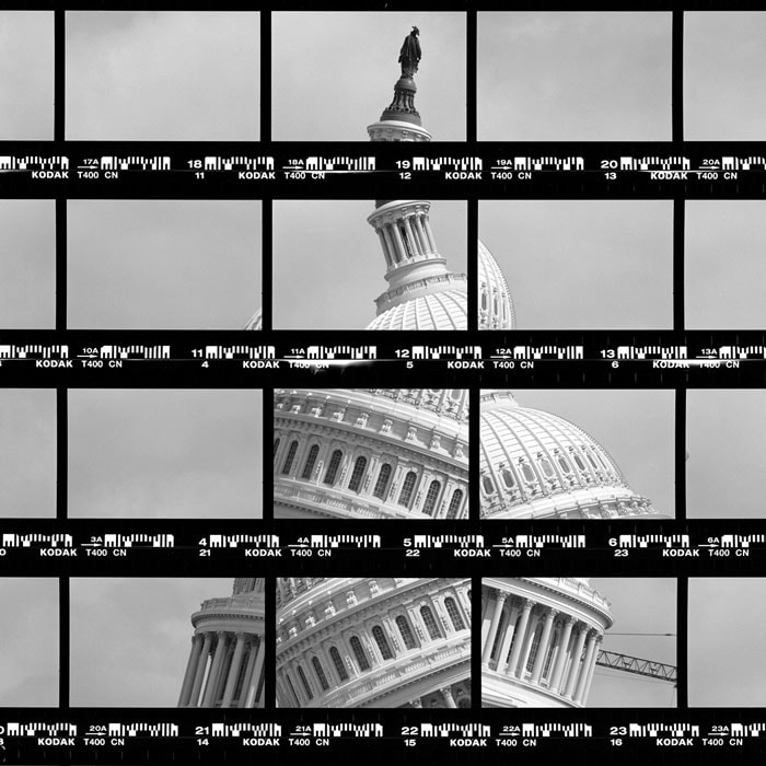
Thomas Kellner creates deconstructed and reconstructed images. He does this by taking a landscape of portrait photo of a building at different angles using traditional film photography. He rearranges the photos and creates a different more abstract version of the building. He wants us to consider how the architecture of the building looks different even though the actual structure stays the same. He wants us to think about how once you can deconstruct something, you will be able to reconstruct it.
Thomas Kellner adresses reinterpreting reality and how we visualise architecture through famous buildings such as the Eiffel Tower. This is interesting because even when he has rearranged the photo we are still able to interpret and understand the building as it was before. Thomas Kellner has used the darkroom to develop his photos. This is because of the traditional film he used in creating his work. This creates a vintage effect and shows how even today, more old fashioned methods of photography can present illusions, distortion or deconstruction and reconstruction. This links to the idea of reality. The fact that he uses film photography which dates back to 1888 shows he is working with a camera from a different era. |
|


3 strands
hendrick kertens


|
|
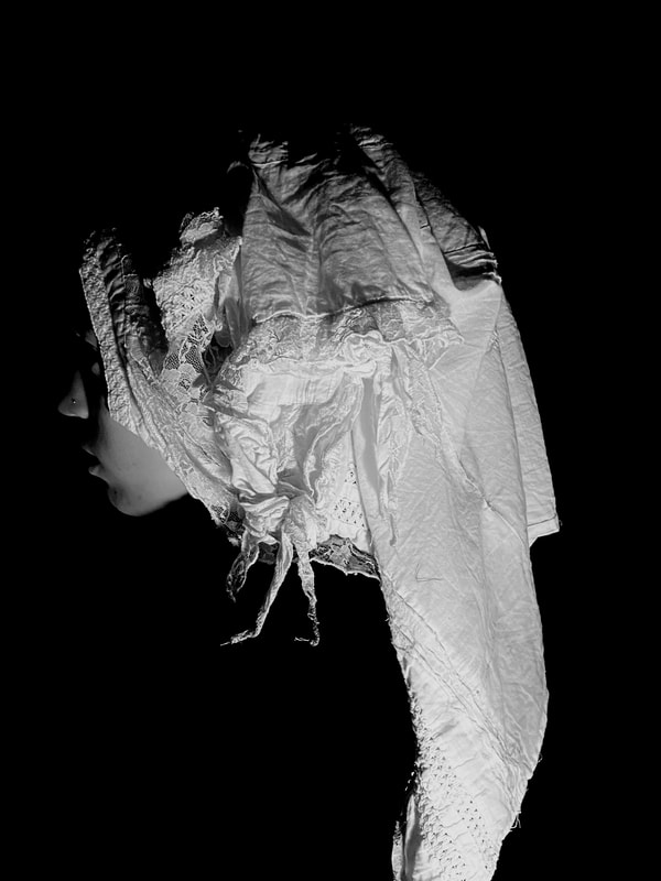
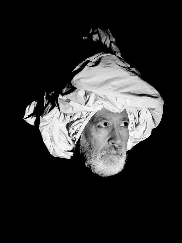
My first strand links to Kehinde Whiley's photoshopped portraits. In these portraits by Hendrick Kertens it shows a more contemporary and modern style of photo. The headdresses posses the viewers attention due to the intense contrast of the black backdrop and the bright or eccentric accessories. I chose this artist because I found it interesting when the body merged into the black of the backdrop and all you could focus on was the simplicity of the colours and headdresses on the models.
|
my chosen response photos
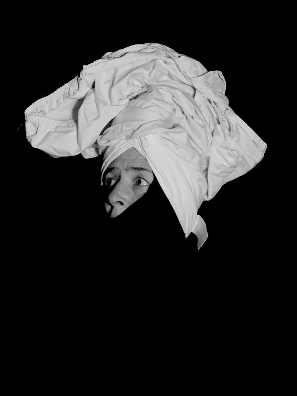
When taking these photos I hung a large piece of black material which created a seamless, blank backdrop. This helped me to edit the photos and make merging the black clothes of my models onto the black of the backdrop. If I were to do this artist again, I would find a better light source to illuminate the face and create more depth and add stronger definition. As well as this, when editing the black background to blend with the black of the clothes, the more I was able to make a smooth black background the more the model's face became more saturated. Due to this I found I would have to make the photo black and white. However the black and white photos became my favourites out of my edited photos as they made the contrast of the backdrop and the headdress stand out more.

|

|
ouka leele


|

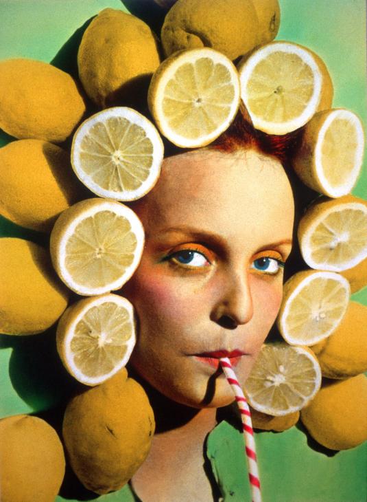
I chose Ouka Leele as my second strand because I admired the way she created types of hair through strange objects like lemons or turtles. This links to my strand about Hendrick Kertens and the use of different materials as headdresses. This work influenced my response because I admired the odd use of objects that Ouka Leele used.
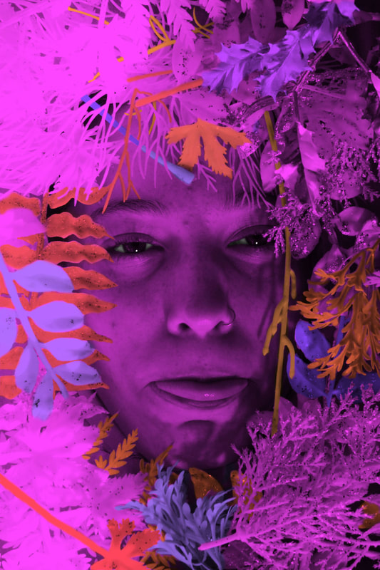
This response worked well because it allowed me to easily change the colour of the pencils and the face by using photoshop. I was able to explore and experiment using different colour schemes. 

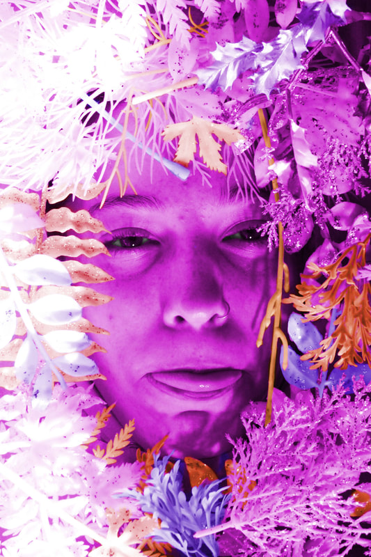
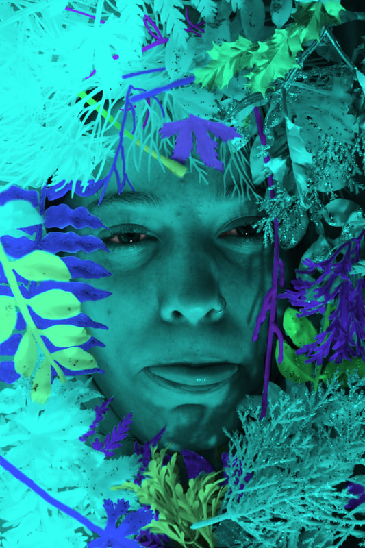
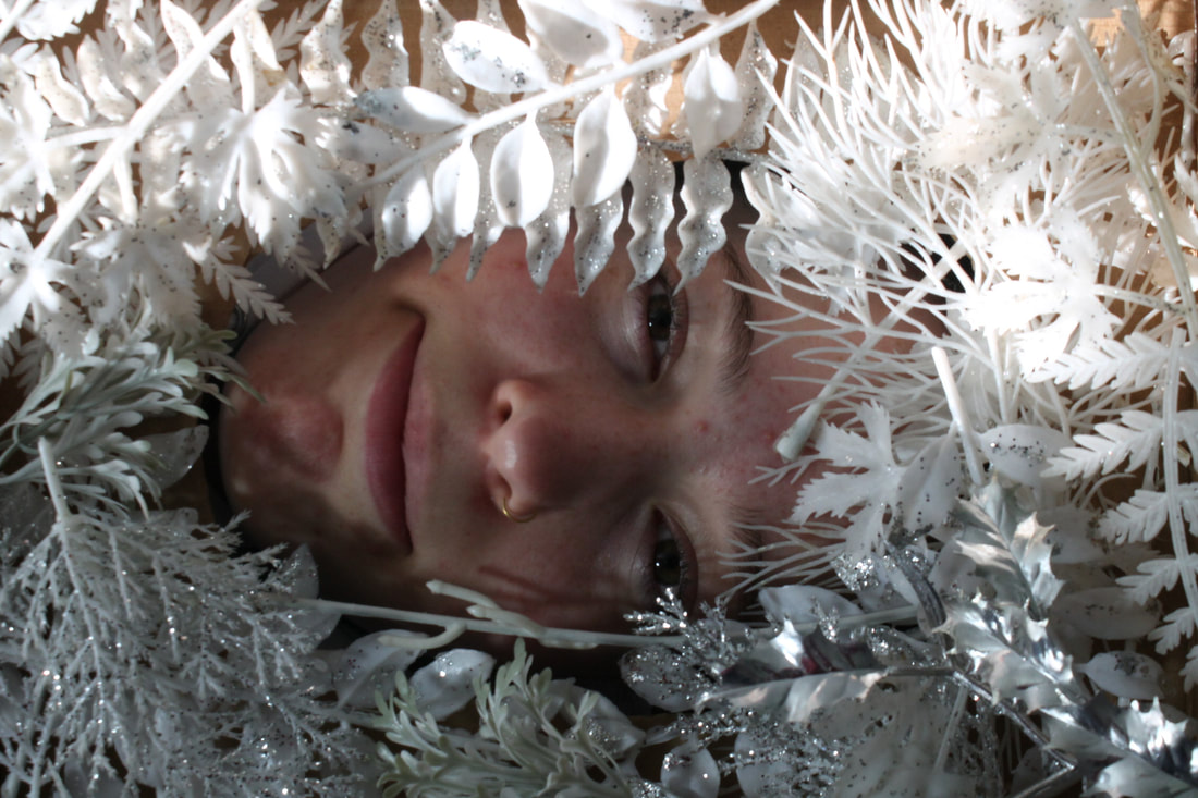
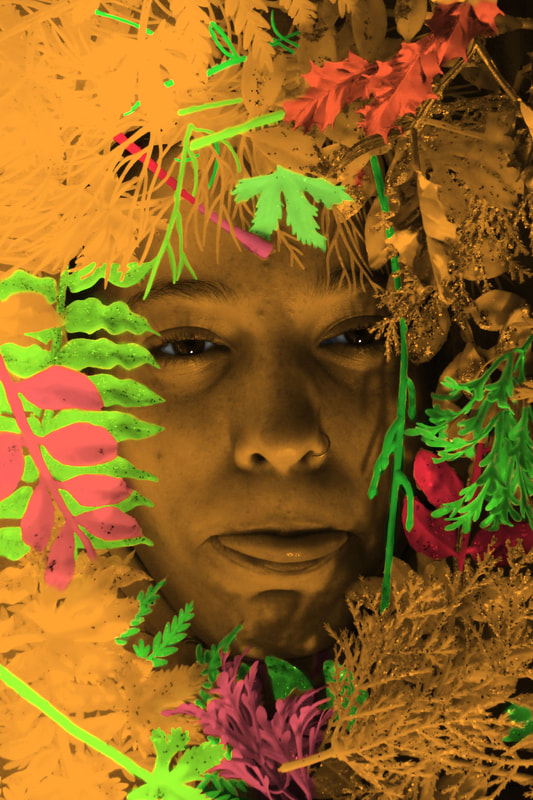
These two shoots worked well because I covered the cardboard cut out around the face with pencils and plastic leaves. I didn't leave any empty space and this made the image look professional and well composed. However, to improve, I will use items that have relevance to the person. For these two shoots the pencils and leaves don't show any significance or relationship to the people in the photos. In my next shoot I will try and find an object that relates to my model. Instead of the strange and random objects used in Ouka Leele's images and the random items I used in my first two shoots, using relating objects will create my own twist and show my take on her work. This helps me discover different ways to change the tone and atmosphere of the image.
|
Ouka Leele creates surreal photographs. She does this by using strange props such as small animals or fruit to present hair or objects that could be used as a hat or headdress. She wanted us to consider the use of high levels of saturation, extravagant compositions and other worldly portraits.
Ouka Leele is exploring the reproduction of reality and focuses on twisting the viewers perspective on what is real and what is not. This is shown by the use of her own neighbours and friends in her portraits and the use of octopi, books or fruit on their heads.
Ouka Leele has used water colour manipulation techniques in creating this work. This creates a highly saturated effect and creates bright colour schemes including pinks, yellows and blues. She does this by turning her photos black and white and then painting over them with watercolour. This helps support Ouka Leele's focus on reality.
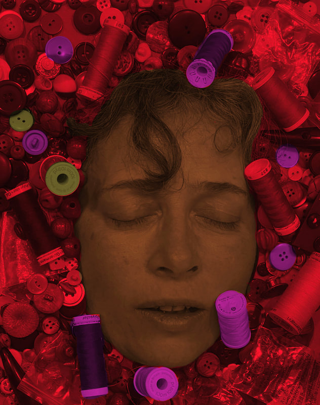
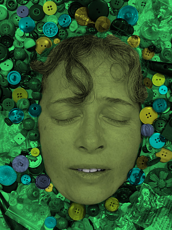
In this third shoot, I chose buttons as objects that relate to my mum. I did this because I felt that because she chose these different types of buttons, every individual one was taken a liking to and therefore was something that she felt sparked joy for her. As well as this the different shades and colours of the buttons made the highlighting of them on photoshop very interesting. Different colour buttons when highlighted in the same colour would create different colours in themselves and this seemed like a good way to express individuality.
Ouka Leele is exploring the reproduction of reality and focuses on twisting the viewers perspective on what is real and what is not. This is shown by the use of her own neighbours and friends in her portraits and the use of octopi, books or fruit on their heads.
Ouka Leele has used water colour manipulation techniques in creating this work. This creates a highly saturated effect and creates bright colour schemes including pinks, yellows and blues. She does this by turning her photos black and white and then painting over them with watercolour. This helps support Ouka Leele's focus on reality.
In this third shoot, I chose buttons as objects that relate to my mum. I did this because I felt that because she chose these different types of buttons, every individual one was taken a liking to and therefore was something that she felt sparked joy for her. As well as this the different shades and colours of the buttons made the highlighting of them on photoshop very interesting. Different colour buttons when highlighted in the same colour would create different colours in themselves and this seemed like a good way to express individuality.
|
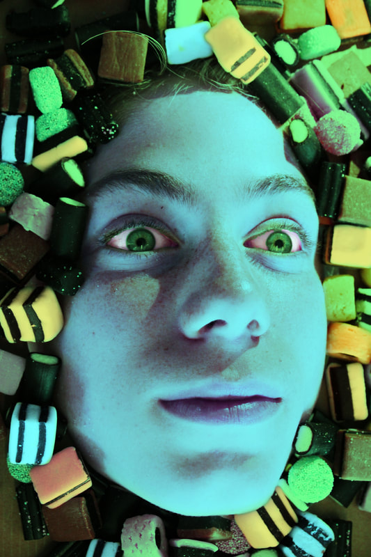
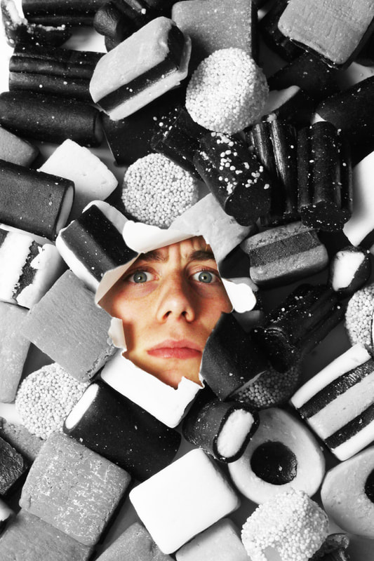
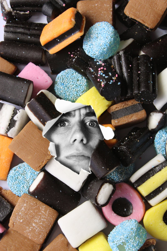
This fourth photoshoot consisted of liquorice in lots of different shapes and sizes. Rather like the buttons, they created interesting colours when highlighted and the different types of liquorice made an interesting pattern around the face. However there are still parts of the cardboard that can be seen behind the sweets. If I were to do this type of photoshoot for the fifth time, I would make sure I had enough sweets to cover the whole of the cardboard.
|
|
|

|

|
|
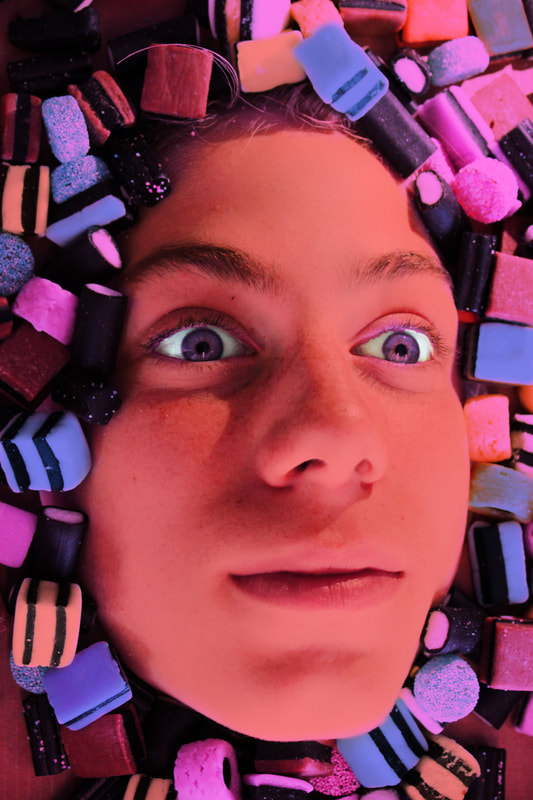
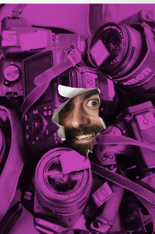
For this photoshoot, I made a ripped whole in a blank piece of paper and hung it up. I then got various people to stand with their heads at the ripped paper while peeking through. In a similar way to the previous shoot, I took pictures of objects that related to the person. I used cameras as the background for my photography teacher, and liquorice as the background for my friend. I layered the picture of the objects over the picture of the paper and person in photoshop and then erased the part of the objects that overlapped with the rip and and face. This left the original face with the background of objects relating to them surrounding them.
|
|
|

|

|
|
|
